My Role: UX Research and Design
Duration: September - November, 2022
Methods: user interview, usability testing, personas, user stories, information architecture, prototyping
View prototype
Wilcoguitar is a place that gathers music lovers and professionals at all levels of musical knowledge to listen, learn and play classical guitar music. The organization hosts events and concerts where guitarists from around the country and the world are invited to come perform.
Through conversations with a leader of the organization, I learned about their four main goals
To draw audiences of all ages and musical backgrounds to enjoy classical guitar performances.
To sustain the business and its musicians through funding from donations and concerts.
To showcase both renowned and emerging classical guitarists
To assist music enthusiasts in gaining deeper insights into the instrument
I was introduced to Wilcoguitar and their need for a redesigned website through a close friend, who is also a staff member of the organization.
Using a mixed-research method, I identified several areas where the old website fell short. These areas span across navigation, page functionality, and UI design. The website failed to provide clear navigation to the necessary pages and starting points for both donation and ticketing flows. It also lacks an adequate amount of information in areas that impact users' trust in the organization. Additionally, the website presents an overwhelming amount of content in other areas, hindering the browsing experience.
Wilcoguitar wants a new website that better serves users with different goals, providing an improved browsing, ticketing, and donation experience, which could ultimately help them build a long-lasting relationship with their users: donors, concert audiences, and music lovers.
User Goals
To learn about user goals and motivations for visiting music organization websites, I chatted with 7 participants (age: 18~54) with different occupations and levels of musical knowledge.
Concerts
To get upcoming concert info
To purchase concert or event tickets for individuals or a group
Donation
To make small donations to support musicians early in their career
Learning
To learn about classical guitarists and their work
To gain musical knowledge
To gauge user expectations and frustrations on the Wilcoguitar's site, I observed each participant interact with the website for 3 minutes. Here are my major findings from their initial experience:
Participants were startled and some annoyed by the background music on the home page.
Participants commented on poor readability due to font choices on multiple pages
Distrust
One participant noted that the difficulty he experienced in finding contact information impacted his trust in the organization.
I conducted task-based usability testing with five participants to assess its fulfillment of user goals, evaluate the functionality of the Wilcoguitar website, and identify areas for improvement.
Concerts
Tasks include finding a concert, viewing key information of the concert, purchasing tickets, making ticket changes.
Donation
Tasks include finding the entry point to make a donation and checking out donation-related information. Expectations for after donation.
Learning
Tasks include finding music recordings and obtaining learning content regarding the recorded piece and the guitarist.
The tests uncovered a total of 21 issues. Given the timeframe, I've focused on addressing 10 of these issues.
This selection was made by prioritizing considerations such as value to the business, the frequency of participants encountering the issue, and by categorizing them as either Blocker/Major/Minor issues or Strong/Normal suggestions based on the nature of each.
Page Functionality
(Blocker, 3+) Unable to find any ticket change or refund policies
(Blocker) Not informed and no control over the automatic played background music
(Major) Not enough information on where the donation goes
(Major) Unable to obtain essential contact information needed for donation questions and ticketing issues.
Navigation
(Major) Trouble navigating back to home page
(Major) Trouble locating link to donation-related information in sticky navigation
(Strong suggestion) Prefer to go straight to purchasing a ticket instead of clicking on a separate ticket sale tab in navigation
Design / UI
(Medium) Low readability fonts
(Medium) Long paragraphs and scrollings on events and donation pages
(Low) Unnecessary use of stock images that makes the pages look crowded
Restructure navigation (including recategorizing and renaming menu items) for easier navigation
Provide easy-to-access contact information and different options to get in touch with the business
Provide user the control over background guitar music (the option to listen, stop, adjust volume or simply mute it)
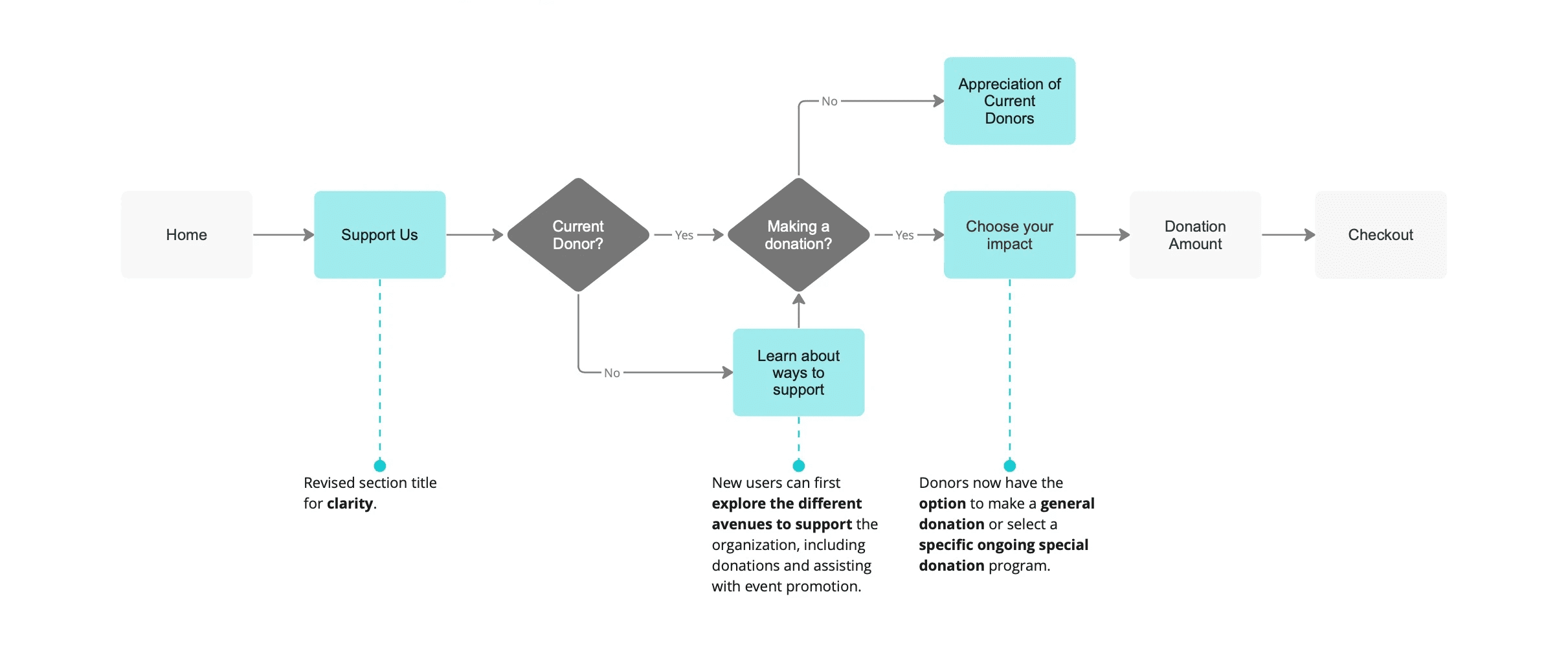
Streamline user flows for ticketing and donation
Optimize the layout of text and images on each page, especially the event page
Elevate the overall aesthetic of the site
As a regular donor and classical music lover, I want to
communicate with the business directly so that I can get questions related to my donation or ticketing answered in a timely manner
be informed of where my donation goes to so that I know how my donations will make a difference.
As a concert attendee, I want to
view a simple and clean concert info page so that I can browse and quickly find the concert that I want to attend.
be informed of ticket policies so that I know what to expect for ticket change or refund.
As a novice music lover and first-time user of the site, I want to
see a more clear text and imagery layout so that I can easily get an idea of what Wilcoguitar has to offer
be able to view all musicians that have playe or will play at concerts so that I can learn more about them and the pieces they perform
The Existing Information Architecture
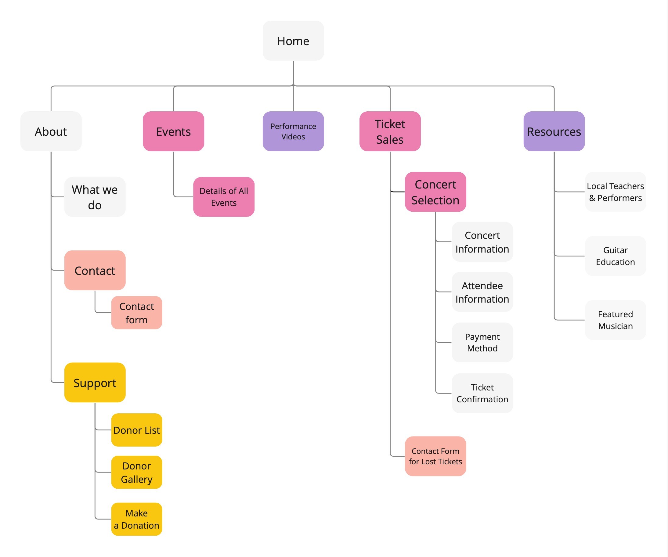
The New Information Architecture
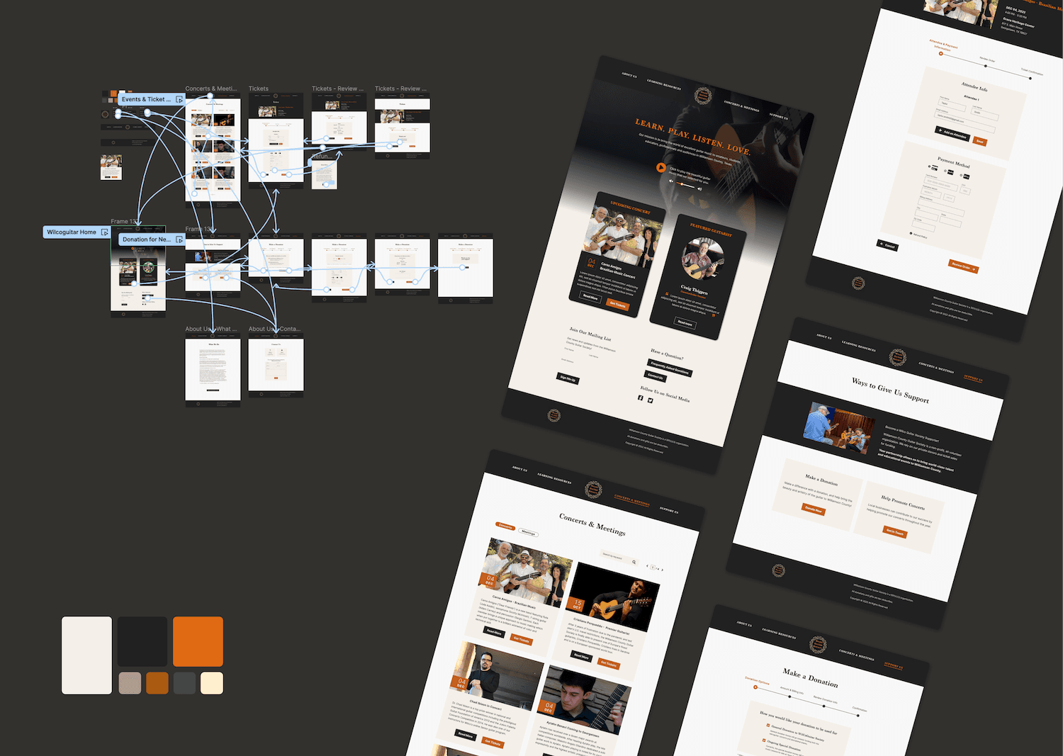
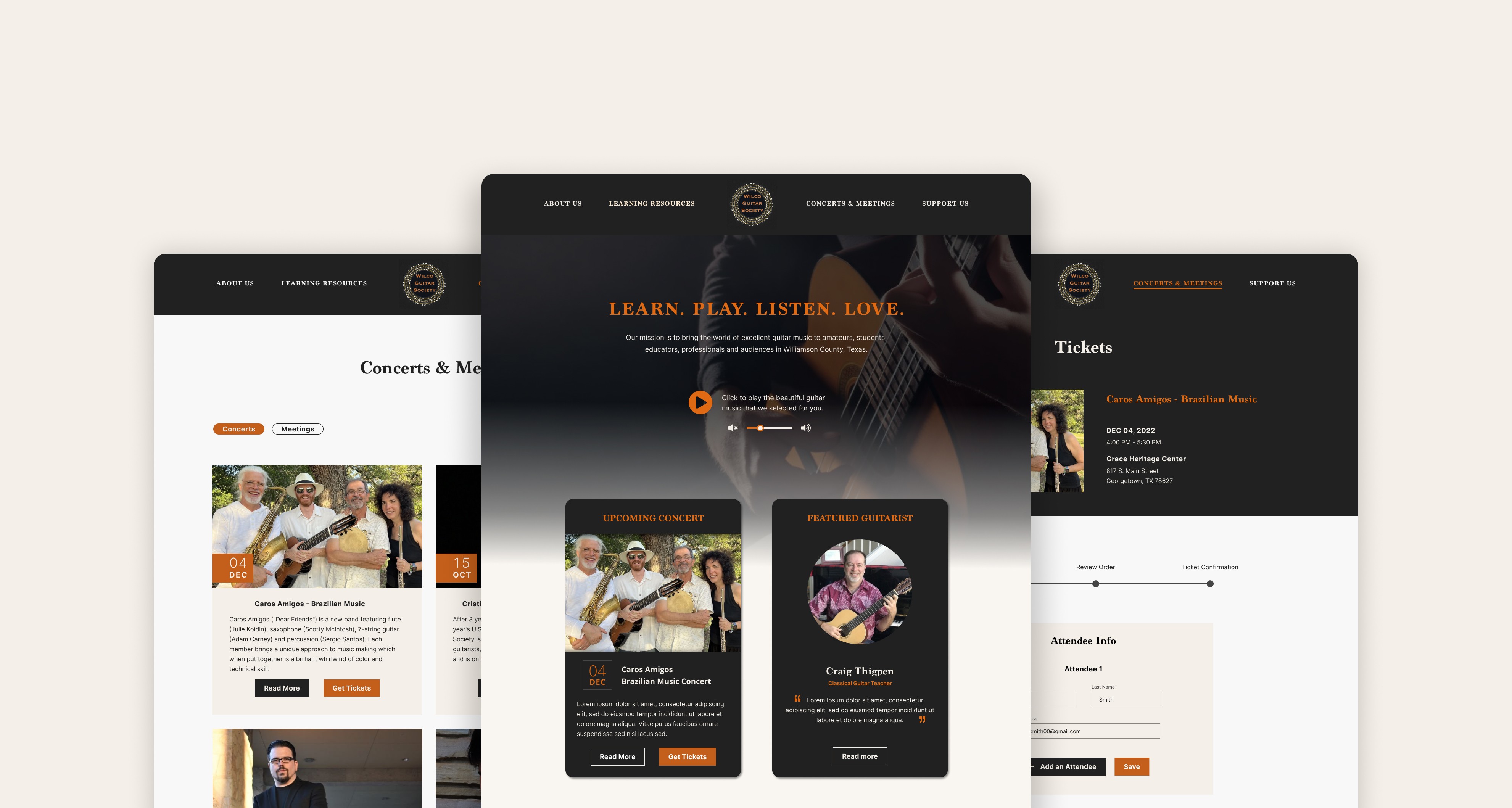
The new sticky navigation provides users with smoother wayfinding and a clear indication of their page location.
Restoring control to users, allowing them to play and enjoy the background guitar piece or opt for a quiet browsing environment, rather than being startled by abruptly playing music upon opening the site.
Users now can easily find all the contact information under the About Us section to choose the one that best suit their needs or preferences.
Concerts and Ticket Sales are two separate tabs. Users expressed the expectation to purchase ticket directly after viewing event info during previous testing.
The original layout was not visually pleasing in terms of image and text layout as well as long scrolling back and forth. Users were not able to quickly absorb essential concert information.
Decluttered concert information by showing only description preview of each event. Users could click on "Read More" for more information on the musician and performing pieces.
Easily scrollable and searchable: users can quickly navigate back to top of the list and search a specific concert by keyword.
"Get Ticket" button to navigate users straight to purchasing tickets for the specific concert.
Keep users informed throughout the process by clearly labeling the steps and indicating user's progress, and by providing ticket refund information both during and after purchasing tickets.
Recap of Original Flow Issues
The Redesigned Flow
Consideration on Future Steps
In the future, prototype testing could be conducted to validate the design and uncover opportunities for improvements to better satisfy both users' and the organization's needs.
Balancing workload and time constraint
This was one of my initial projects in UX. While there is plenty of room for improvement, one valuable lesson I learned from it and applied to my later work was the strategy of prioritizing design tasks based on their urgency, user impact, and value to the business.
Reflecting on the research and persona creation process
I recall being confused at the very beginning of my UX study by the lists of research methods that I was tasked to follow, including heuristic evaluations, surveys, use interviews, usability testing, and card sorting. However, upon revisiting this project a year later and gaining more practical experience applying research methods in real-world projects, I began to realize the importance of selectively utilizing those research methods that align with the project scope and timeline.
