Project overview

The capability of the existing header and footer navigation, originally designed for short guided learning practices, was expanded to help students smoothly navigate among 10-15 practice problems. Additional functionalities were added to allow students to watch question-specific solution videos, re-attempt questions, and move forward.
Prototype
Project overview
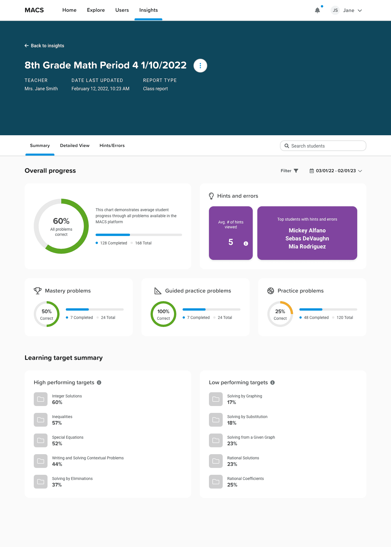
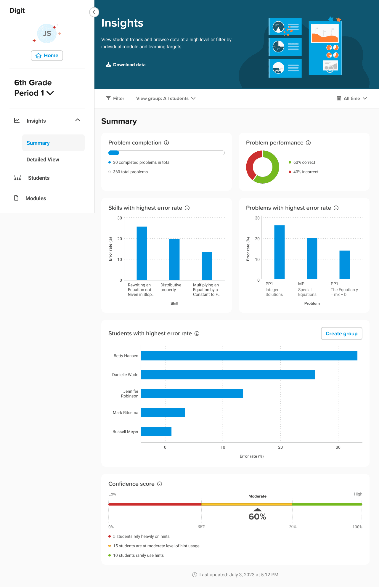
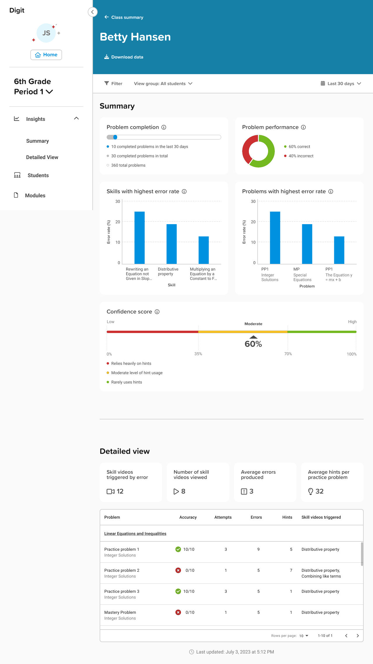
According to previous research, the team found that teachers are more willing to use the data dashboard but find the existing dashboard difficult to use. They are unsatisfied with the type of data displayed and found it difficult to view and utilize that data to create an action plan.
User Stories
& Mockups
With a list of usability issues and user needs identified, the team prioritized them based on severity levels and created user stories. These stories were then transformed into new data visualizations and the implementation of new types of data. The dashboard layout was also redesigned with consideration for future potential, allowing teachers to customize their own dashboards based on their teaching needs.


Project overview
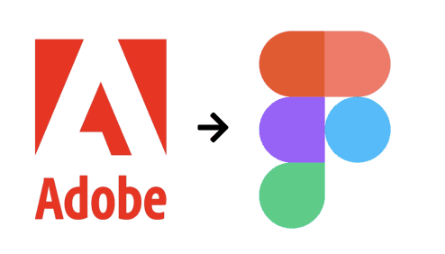

In 2023, the teams at EdPlus, which develops several educational digital products including Digit, decided to transition gradually from Adobe XD to Figma. As we transferred a large volume of visual assets, I proposed developing a design system for Digit to meet the requirements for scalability, efficiency, and consistency in future projects.
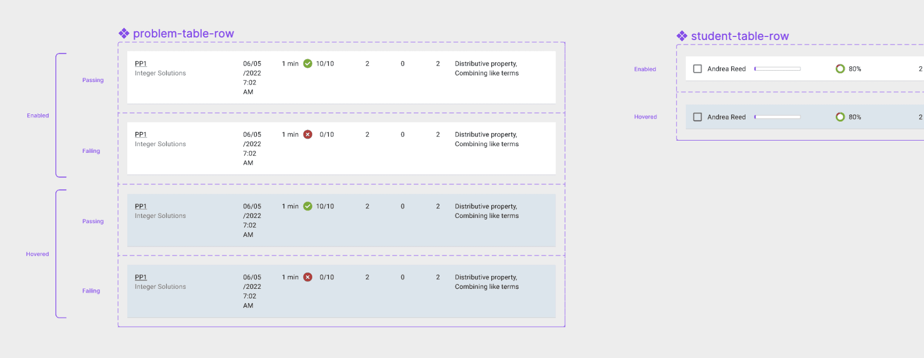
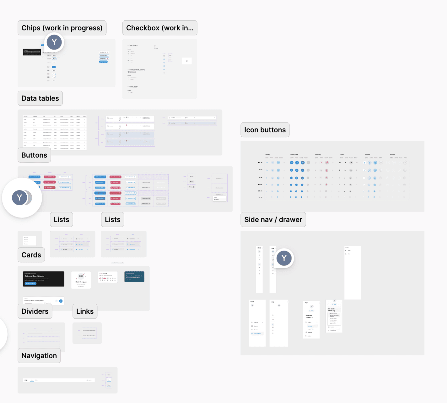
On this project showcase page, you'll find some of the Styles and Components I developed in collaboration with another designer, Valeria, and the engineering team. However, a design system is much more than just a collection of styles and components; it amplifies the potential for the long-term evolution of Digit.
The foundation
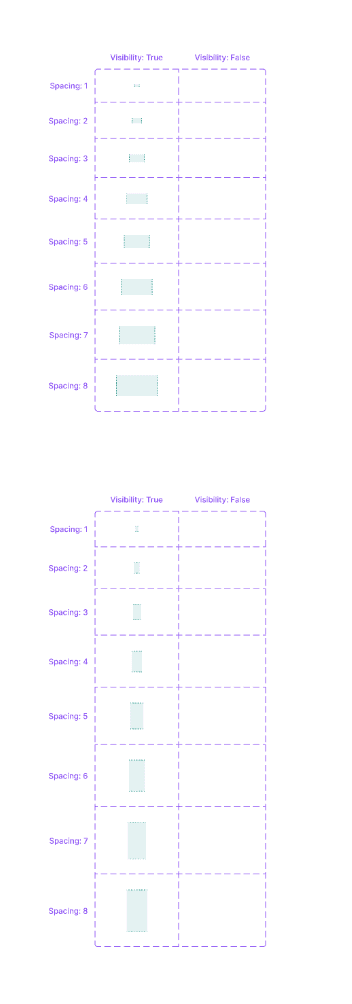
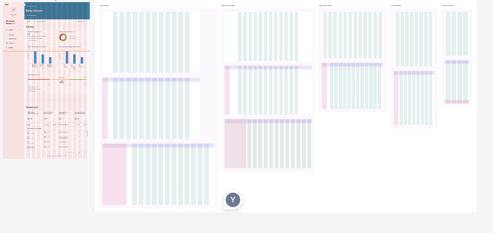
The foundation of this design system includes a spacing and grid system, upon which everything else is built. To users, these may be invisible elements, but they play a significant role in maintaining a consistent look and enhancing efficiency during the visual design stage.
Typography
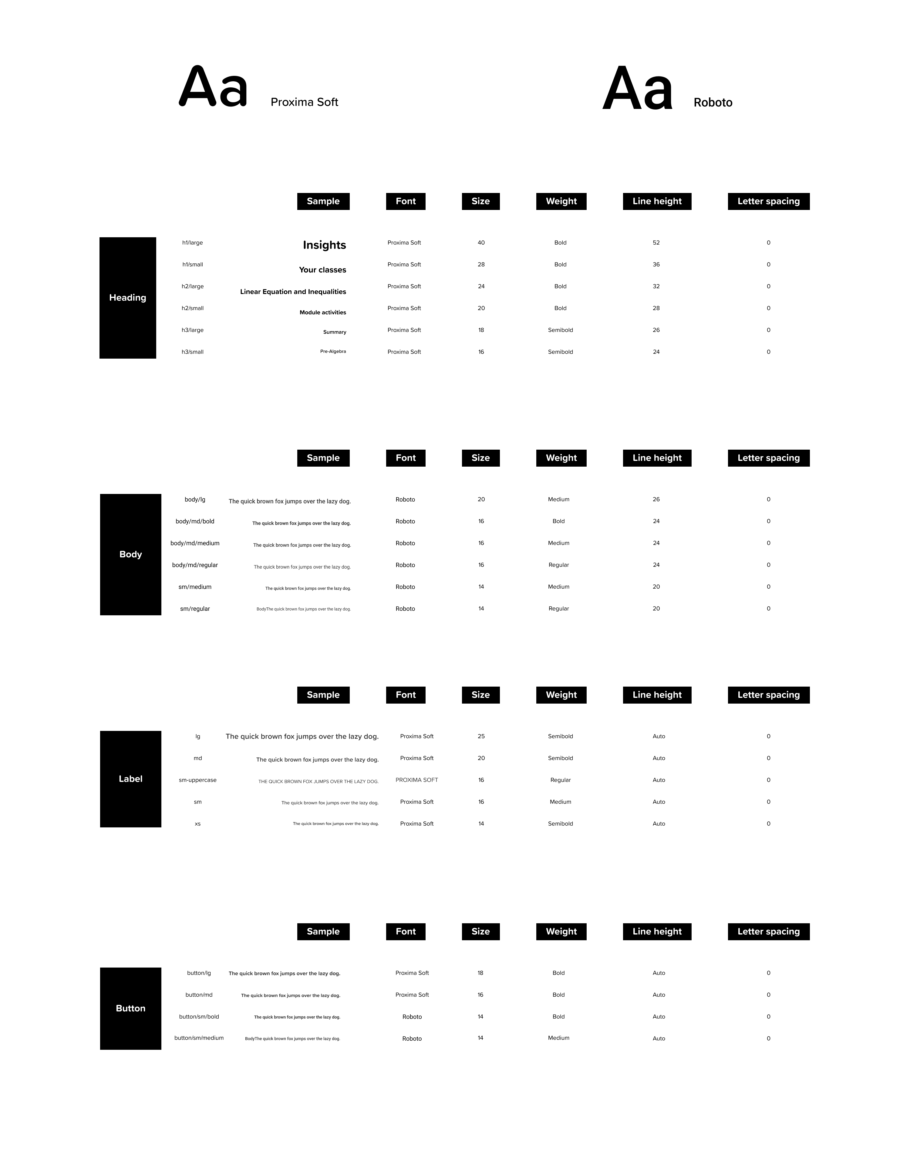
Since my colleague Valeria has already established a rich typography style for Digit using Roboto and Proxima Soft fonts, I reviewed all the existing design files to gather variations in weight, size, line height, and letter spacing. I categorized these based on their usage as headings, body text, labels, and button text. I then identified inconsistencies in usage, streamlined the variations, while still maintaining a diverse selection to ensure versatility.
Color palette
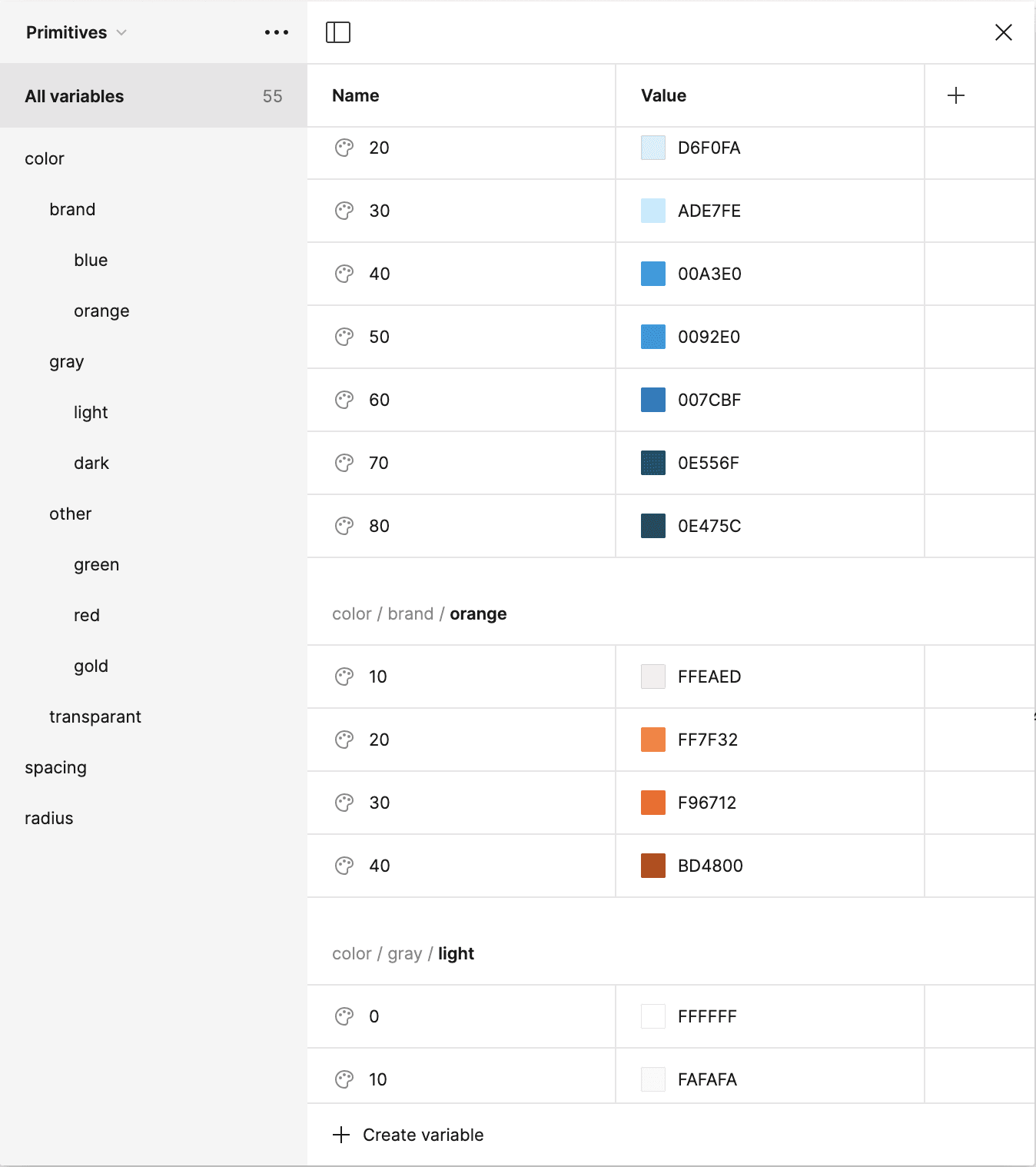
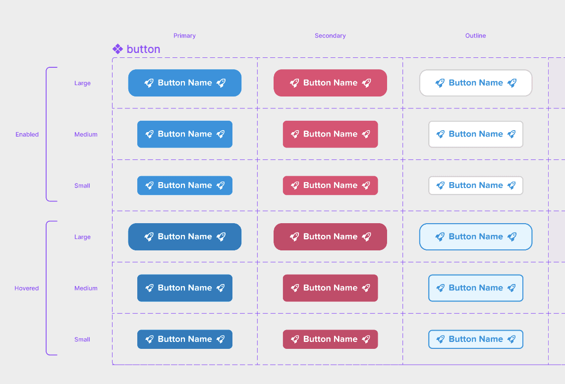
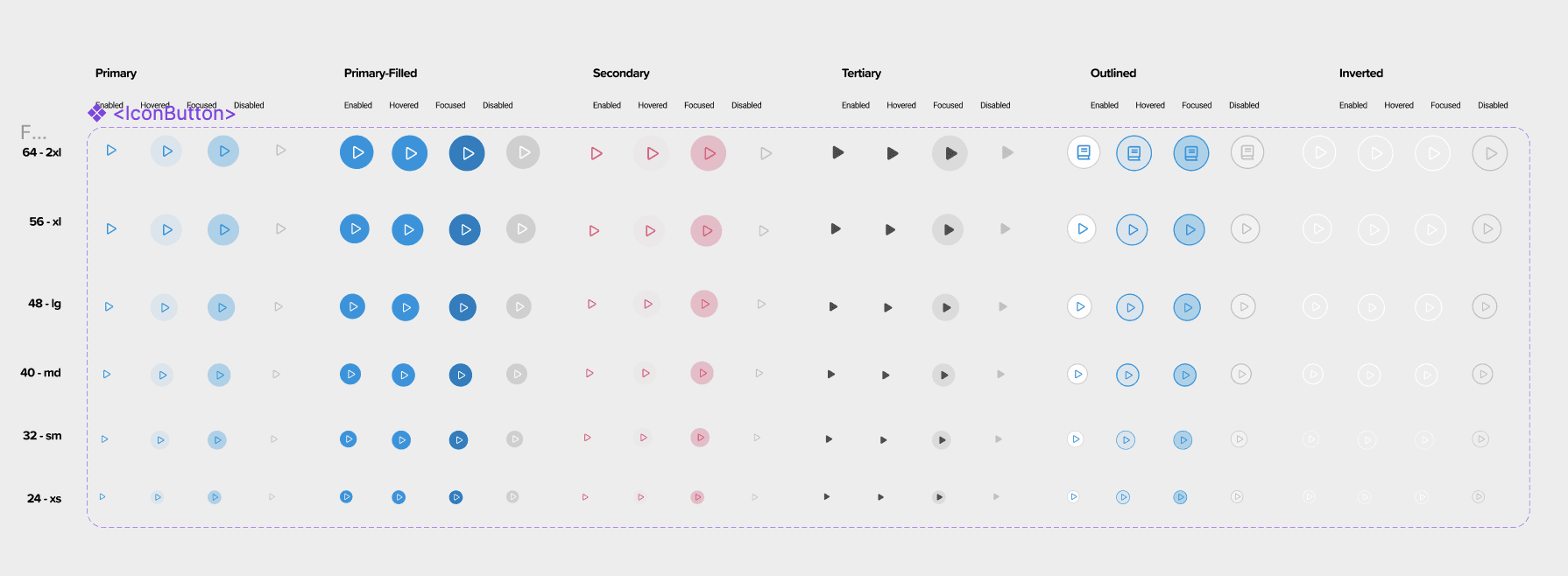
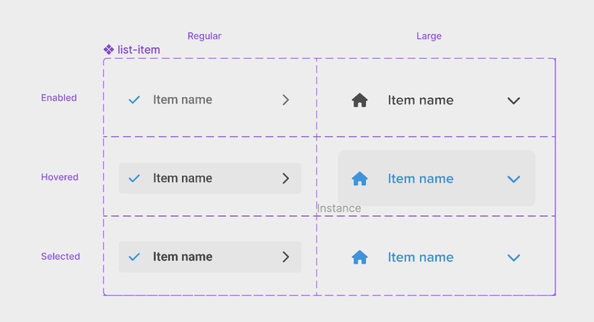
Documentation
While building out more frequently used components, I am currently working on the documentation for Cosmo that will later be added to Zeroheight to provide the team and future members with:
A clear explanation of what each component is
Component anatomy
Guidelines on how it should be used
Dos and don'ts
Visual examples to supplement the explanations
Meanwhile, to maintain Cosmo's robustness, flexibility, and adherence to best practices, we will continuously iterate and expand the design system. This approach enables us to enhance its capabilities, improve accessibility, integrate new components, and adapt to evolving requirements.