The typical online purchase take over 3 hours
SWNS Digital. (2020, September). The typical online purchase involves seven steps which take just over three hours.
My Personal Experience
Project Timeline
Usability Testing on Checkout Experience
Tasks included examining a cart containing 20 items and performing common actions such as locating specific items, removing items from the cart, and saving items for later.
Additional Questions Regarding Delivery Experience
Towards the end of each testing session, I asked participants these questions:
Have you experienced having a package delivered while you are not home?
How did you feel about the situation and deal with the situation?
App Store Reviews
To validate my previous findings and uncover any additional pain points or usability issues not found in the user testing and interviews, I checked out the App Store reviews of the Walmart app. However, recognizing that individual reviews may represent outliers or be influenced by unique circumstances, it was crucial for me to look for consistent patterns across multiple reviews.

Problem Areas Identified
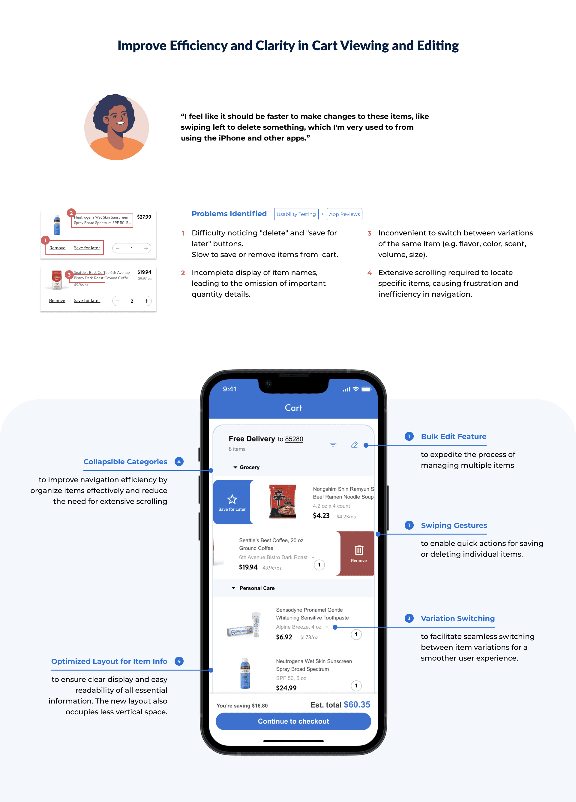
Challenges with Viewing and Editing Items in Cart
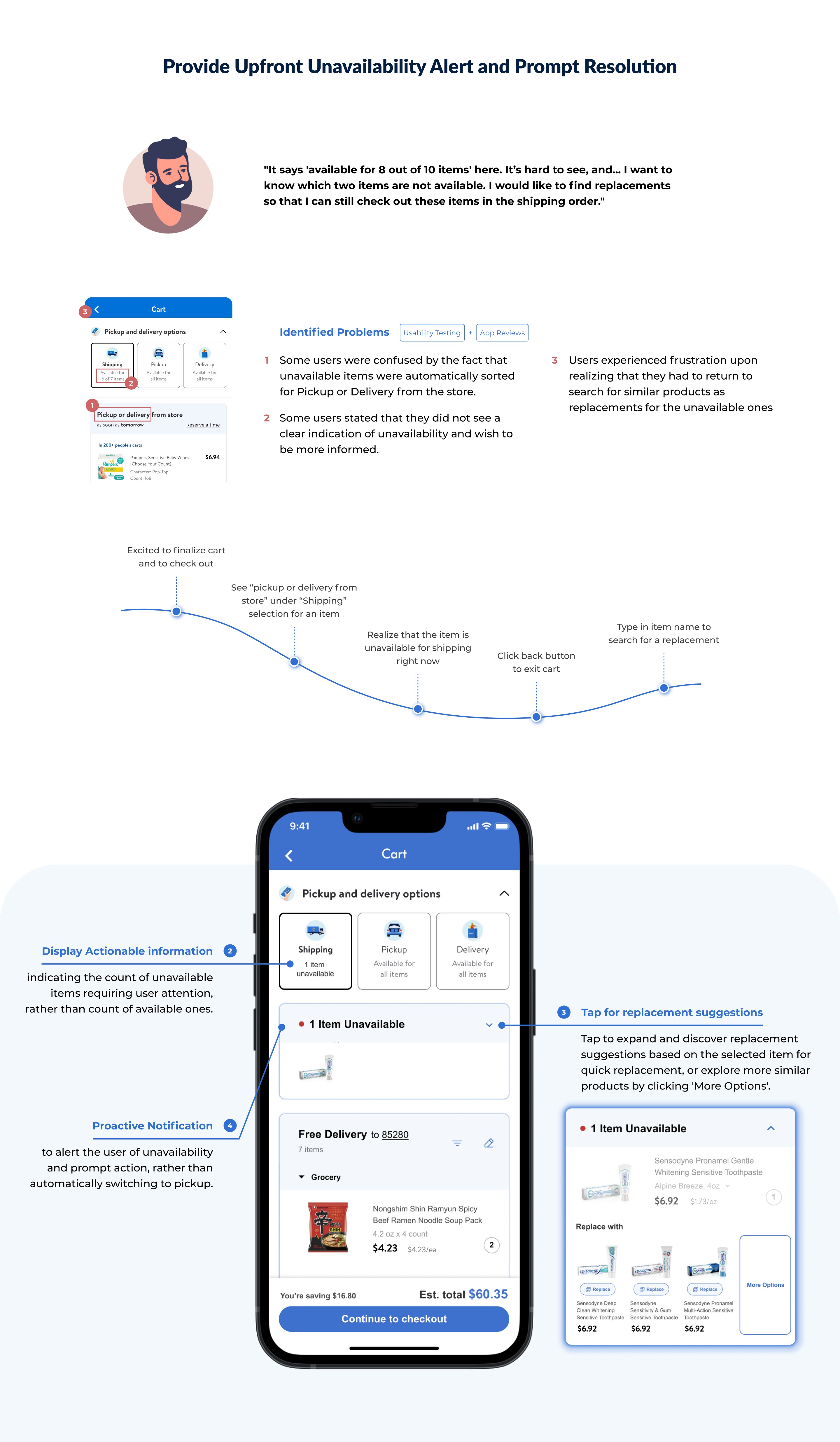
Frustration due to inadequate alerts for unavailable items and lack of resolution
Lack of control over receiving orders
FUTURE STEPS: Testing, iterations, success metrics
To validate the design decisions and pinpoint opportunities for refinement, additional testing is required. This could include assessing task completion rates, gathering user feedback (through surveys, interviews, or usability testing sessions), and monitoring changes in user sentiment over time.
Takeaways
Reflecting on Accessibility
After gaining deeper insight into accessibility guidelines and industry practices upon finishing this project, I realized a few spots within my design where accessibility considerations were lacking. Since then, I have been continuously learning to build more accessible and equitable user experiences for all individuals.
Walmart app recent updates vs my redesign
About half a year later, I noticed that the Walmart mobile app had quite a few new enhancements in its checkout flow. These included notifications and resolutions for unavailable items that closely mirrored some of the redesign choices I had implemented :)


