*Actual visual assets involved in the project are not included here due to NDA. Please contact me for more details.
The Problem

Designers across different teams had created their own versions of selection components within profile building, reporting, chat games, and subscription flows.
We wanted to create a new component with a unified look that all designers can access, allowing shared components and styles in any new project, and for engineers to efficiently integrate them into their development processes.
The Audience
Product designers and Engineers that need a reliable and reusable component for these “selector” use cases.
Millions of end users will also benefit from consistent visuals and interactions between use cases.
Use Case Audit
To thoroughly audit all use cases within the product, I
gathered 59 screens across profile, growth, revenue, trust & safety features;
examined the usage of all existing selection components and organized them into four groups based on their composition and layout;
explored other relevant platforms for reference;
removed use cases that deviate in functionality from those intended for making selections.

I communicated my findings with senior designers, who then worked with me to narrow down the use cases. I then started looking for commonalities among use cases to categorize and define the new component we are about to build.
Compared to a List item, a selector contains additional elements like a background fill, a border, an image, or a selection indicator.
Functionality-wise, unlike tapping on a button, tapping on these selectors does not trigger a response, such as opening a new screen or entering a different flow.
Layout-wise, these selectors appear in a row or grid, containing at least one line of text. Some may include a second line of text, an image, or a selection indicator.
Issues & Opportunities
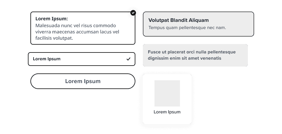
Unclear indication of single or multi select capability.
Not enough accessibility compliant visual distinction between different states, especially selected vs unselected.
Inconsistencies in styling such as border radius, border weight, fill color, font color, size and weight, alignment, spacing, use of shadow, etc.

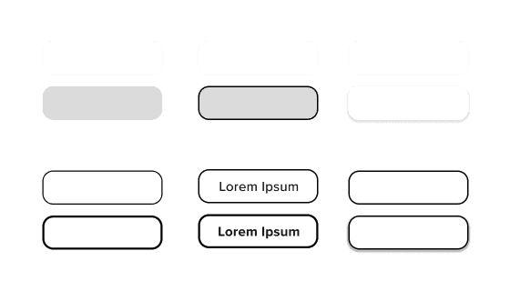
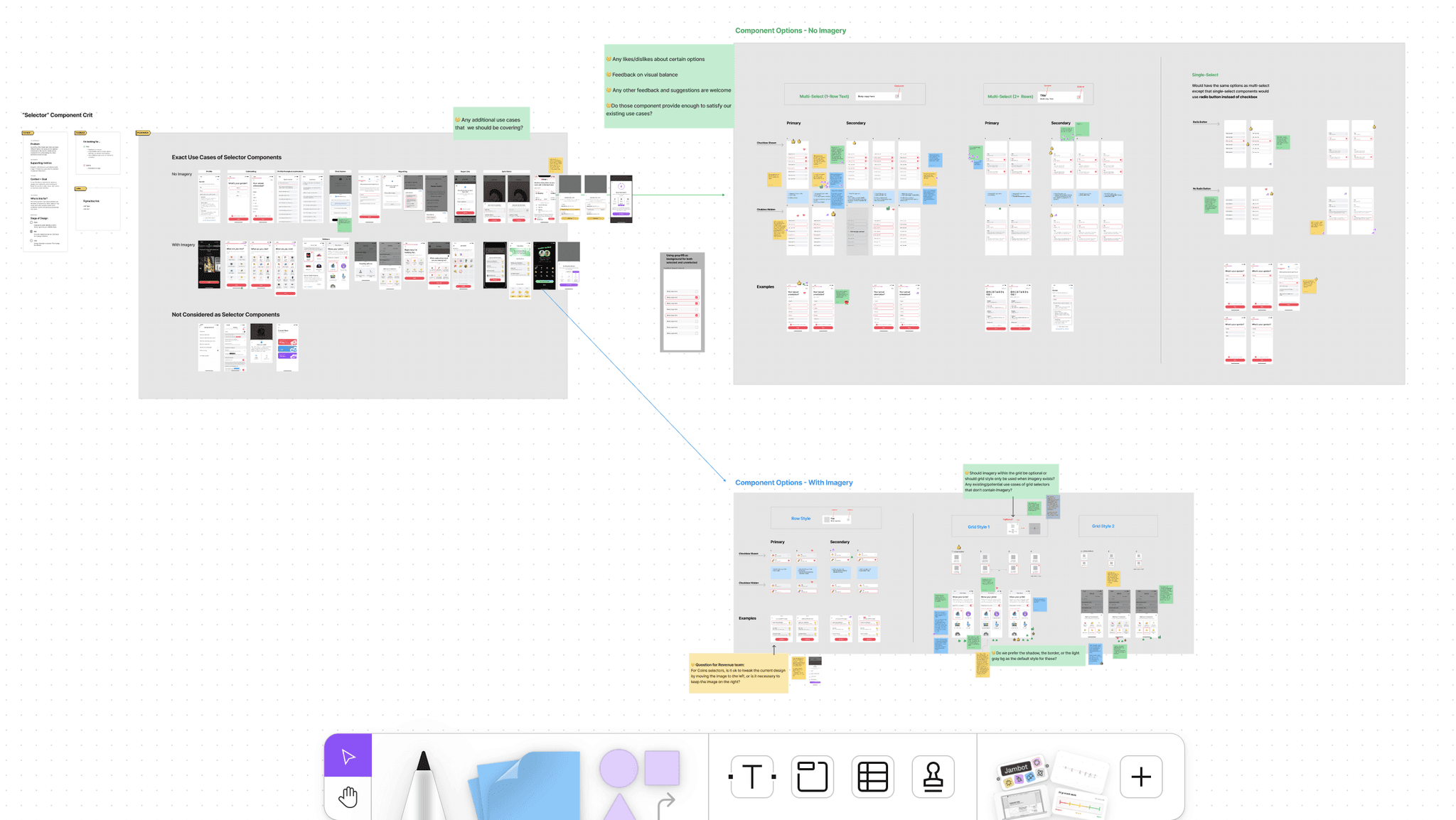
I presented the use case audit findings and discussed design solutions with the product team consisting of designers, researchers, and managers.
The team gave me lots of sticky note feedback including comments, validations, and suggestions for the next iteration round.
Synthesize Feedback
Upon reviewing the Figjam board, I identified these common themes:
Some like the combination of grey background with pink border for selected state because it creates a clear differentiation. It would make for a easier viewing experience for vision impaired users.
Some believe that pairing a pink border with a grey background doesn’t contribute to immediate clarity for which state is the selected vs deselected."
Likes having the additional delineation between selected/not (having both a change in border color and text weight)"
The use of grey is looking disabled (they look like pressed down), maybe it’s worth mocking up what a disabled state would look like vs active to make sure there’s enough distinction?
The pastel pinkish background (a lighter shade of the brand color) looks very nice aesthetically, but it might be interpreted as an error warning by some users.
Iteration to Address New Challenges
New Challenge #1
Is it possible to utilize the pastel pink color in a manner that prevents potential confusion among users who might interpret it as an indication of an error?
Design Decision
While aesthetically pleasing, we wanted to eliminate any possible confusion, so we decided to not use the pastel pink as a background color entirely. However, given the recognizability of the app's pinkish-red brand color, it is less likely for users to mistake it as an indication of error. Therefore, we have chosen to consistently employ the pinkish-red brand color as both the border color and the fill color for selection indicators.
New Challenge #2
If we intend to maintain white and light grey as background colors for different states, how can we prevent the component from appearing disabled? OR If we opt for the same background color, what additional measures should we take to ensure accessibility compliance?
Design Decision
To prevent any confusion from the component looking disabled, we opted to maintain consistency by employing the same background color for various states. Additionally, we incorporated a border or altered its color to signify selection. However, solely altering the border color fails to comply with accessibility standards. To address this issue, we decided to make the use of a selection indicator mandatory with this variant and ensure that all designers are informed through clear component usage documentation.
New Challenge #3
Any other state(s) that we should take into account?
Design Decision
Though uncommonly used in the product, it was still necessary for us to mockup all possible states including the disabled state as suggested by colleagues in design critique.
Finalize Design
We eventually decided to proceed with two options, a primary component and a secondary for a consistent yet flexible implementation. We presented our refined design to the leadership team for final review.


Design System Documentation
Before handing over the project as the internship comes to an end, I established the documentation for the new selector component. The documentation includes: Name and Description, Anatomy, When to & no to use, Variants, Sizing, Design Tokens used, and Accessibility Considerations.

